As a side project I built Sydney Transit Graph – a visualisation of real-time Sydney bus congestion. Each line on the graph (a Marey chart) represents a bus completing its route (percentage) over time.
It’s open source on Github, however I am no longer hosting it due to server costs.
The web app displays a map side by side with a Marey diagram. When you move your mouse across the horizontal (time) axis of the diagram, the locations of the buses are displayed at that point in time. The colour of the line represents the occupancy (warmer colours -> higher occupancy) of the service.
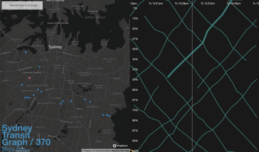
Sydney Transit Graph uses a Marey diagram to view bus congestion in Sydney – showing the current (and historial) location of every bus.
Clicking on a line on Sydney Transit Graph highlights the position of that particular bus on the map.
The slope of the line indicates how fast the bus is going (distance verses time). A shallow line can be read as bus congestion.
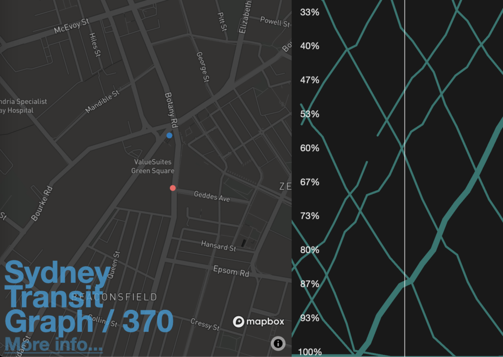
Long headways
A large vertical gap between lines indicate a large distance gap between buses, and a large horizontal gap means a large time gap. Usually these are equally big or small!
In this example, there is a bus heading north-west that doesn’t have a service behind it. More people accumulate at the bus stops in that time, leading to the occupancy of the next bus being higher (orange means higher occupancy). The next bus after that also appears delayed, leading to…
Bus bunching
When the lines are bunched together, there is bus bunching – the phenomenon of multiple buses on the same route arriving at the same time (see the bus bunching Wikipedia article for an explanation on why this occurs)
Why does bus congestion matter?
Less bus congestion results in faster trip times, which in turn reduces labour costs, decreases bus headways (or reduces need for new buses) and improves passenger throughput.
Possible future work
Further analysis that would be interesting would be:
- Correlating congestion hotspots with OpenStreetMap lane data to better inform bus lane implementation policy
- Analysis of pre/post COVID-19 transit patterns
- Including train data in the pipeline (it’s the same API)
- Improve interpolation of routes on the frontend so it’s not just a straight line average between dots (interpolating along the route instead)
I’m not sure if I’ll have the time to get to this, but please let me know if you’re interested in analysis with this tool! I’ve been busy with life and other side projects so I haven’t made updates in a little while.
How it works
The web app is built with vanilla JS (TypeScript), p5.js for the graph, and Mapbox GL JS for the map (which uses OpenStreetMap data).
Data is sourced from Transport for NSW via OpenData. Realtime data is ingested every few seconds via an service running on AWS EC2 to store Protocol Buffer files on AWS S3.
When requested via an API, a service on AWS Lambda retrives these Protocol Buffer files and computes the trip progress and occupancy of every bus in a specified time window.
I adjustably quantise the number of Protocol Buffers requested (and thus the number of results) via looking up available timestamps.
Trip progress is calculated by comparing positions against bus route shapes. These route shapes have been precomputed from GTFS database dumps (via Sqlite) and stored on AWS S3 as JSON.
It’s definitely not the cleanest or most efficient architecture, however I haven’t had the time to make a big refactor recently.
Known issues
- There are some line rendering issues in Safari
Prior art
- Visualizing MBTA Data: An interactive exploration of Boston’s subway systemMike Barry and Brian Card: https://mbtaviz.github.io/
Conclusion
Contributions are very welcome! If you have ideas on a project or analysis I’d love to hear. Feel free to contact me at [email protected] or leave a comment.
Leave a Reply