I’m pleased to share the completion of a recent commercial engagement with the Heart Foundation: the Community Walkability Map, a new interactive tool designed to help communities understand and advocate for more walkable, healthier neighbourhoods.
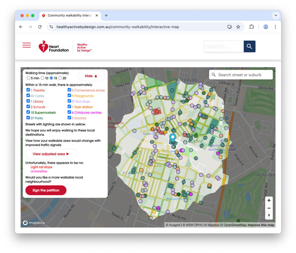
Table of contents
About the Project
The Heart Foundation has a longstanding commitment to environments that support heart health, physical activity, and healthy living. As part of this mission, they commissioned a user-friendly platform that visualises pedestrian access to everyday destinations – empowering residents, advocates, and planners alike to identify opportunities for improvement in the built environment.
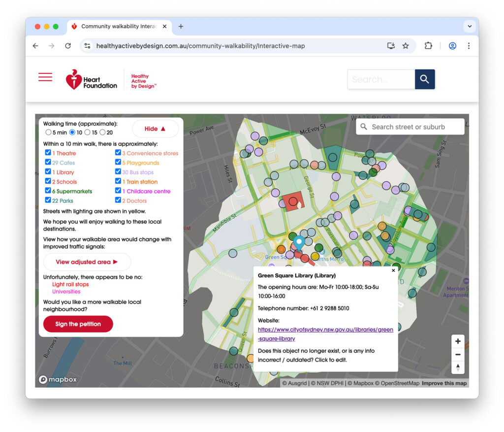
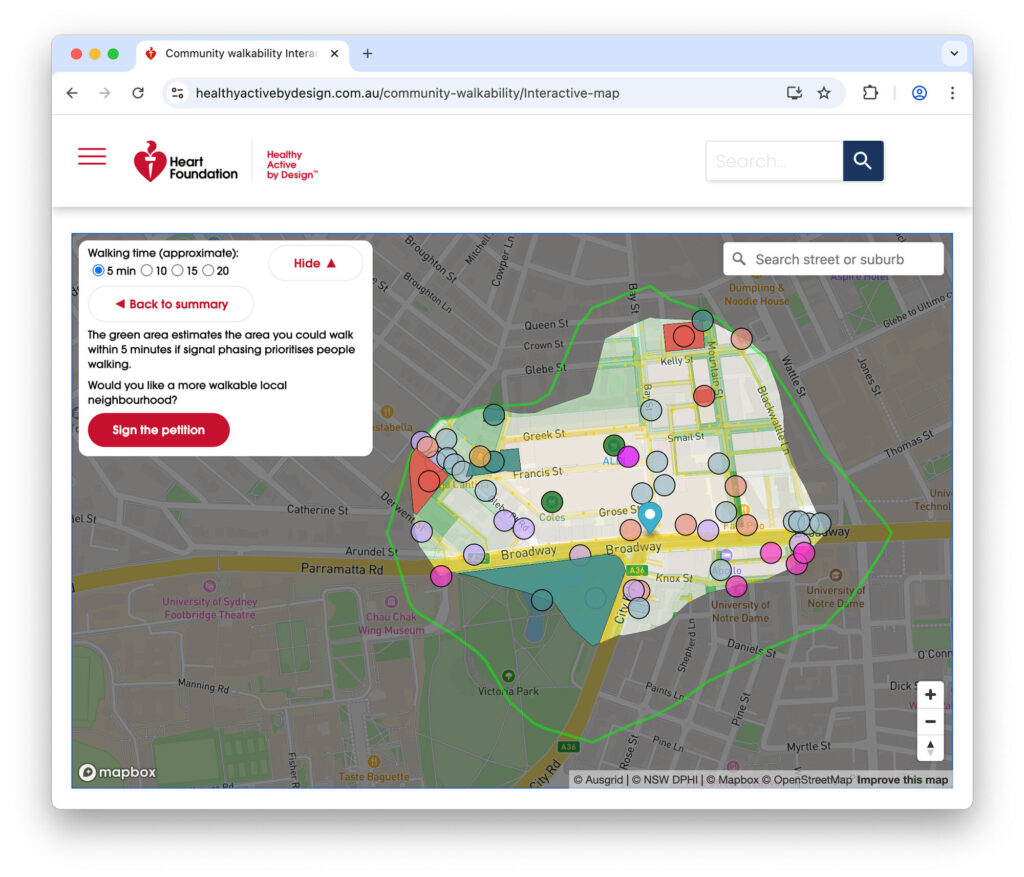
The map allows users to drop a pin anywhere in Australia and visualise accessible destinations within 5, 10, 15, and 20-minute walk catchments. These walkability catchments are not based solely on distance – they account for real-world walking conditions including path connectivity, barriers such as highways, and signal timing delays.
This map is now a central feature of the Heart Foundation’s Community Walkability website, which also includes community checklists, fact sheets, planning guides, and a Supporters’ Toolkit for professionals in the built environment sector.
A Data-Driven Tool for Policy and Advocacy
A key innovation of this project is the integration of traffic signal delay-aware isochrone modelling – a methodology that highlights delays to people walking at crossings, often overlooked in conventional walking catchment calculations.
Built using open-source OpenStreetMap data, the tool translates complex urban transport data into an intuitive, map-based interface that supports both strategic communication and policy engagement.
From a technical perspective, I led all aspects of the solution design and delivery, including:
- Co-design and scoping with the Heart Foundation team
- Project management and delivery oversight, using an incremental approach with regular status updates
- Backend isochrone algorithm development, implementing signal delay estimation
- Geospatial data integration and transformation
- Serverless backend development
- Graphic design
- Frontend software engineering
The end result is a tool that blends open data, urban analytics, and visual storytelling to support healthier, more walkable communities.
Data Sources
The map’s core walkability modelling is based on OpenStreetMap (OSM) data. Where possible, users are encouraged to contribute updates to OSM or via the Mapbox contribution portal.
Additional datasets integrated under agreement with the Heart Foundation include:
- Street lighting data from Ausgrid and Citipower
- Tree canopy coverage from the NSW DPHI (CC BY 4.0)
- Traffic signal delay data from Better Intersections (ODbL licensed), supplemented with interpolation or estimated averages in data-sparse areas
Users can explore data attributions directly via the map interface and are welcome to contribute additional signal timing measurements here.
Reflections
It was a pleasure to work closely with Anna Gurnhill and the broader Heart Foundation team throughout this project. Their vision, clarity of purpose, and genuine commitment to creating healthier, more accessible communities made this a rewarding collaboration.
What’s Next?
If you have an interesting challenge in the urban analytics, planning or community consultation space and would like to collaborate – let’s chat.
You can also read more about my background, including my five years as a full-stack engineer at Atlassian, open source work and policy advocacy here. I’ll have more to share on a new commercial entity soon.
I’m looking to further explore the potential of traffic signal-aware isochrone analysis to quantify urban accessibility and support data-driven planning and placemaking initiatives.
I’m particularly interested in applying similar methodologies to cycling network analysis.
I retain ownership of the underlying IP developed in this project and am open to discussing its further application in other domains.
This blog post has been reviewed with the client before publication.
Leave a Reply to Jake C Cancel reply