Tag: chart
-
Visualising Sydney bus congestion with Marey charts

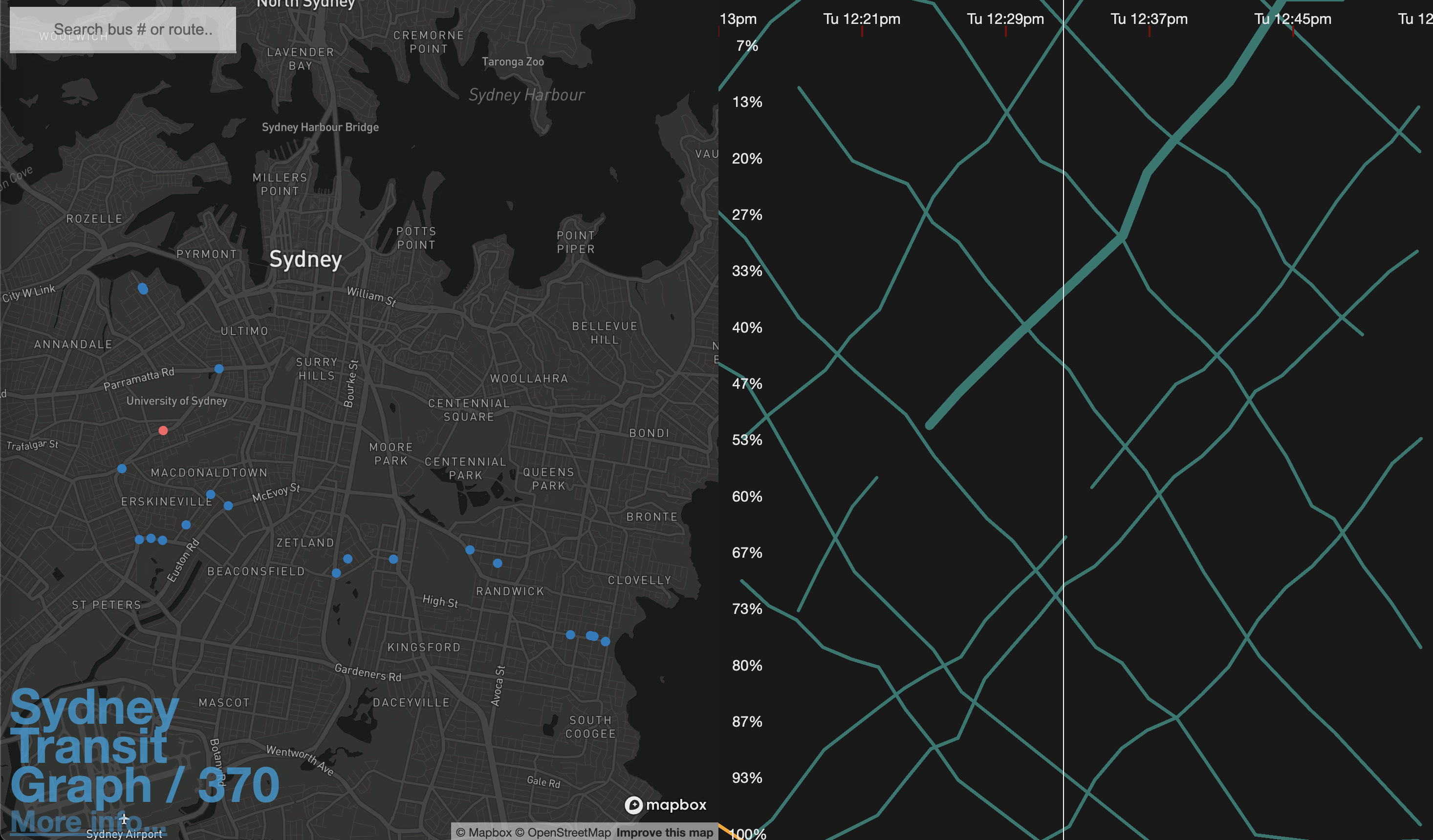
As a side project I built Sydney Transit Graph – a visualisation of real-time Sydney bus congestion. Each line on the graph (a Marey chart) represents a bus completing its route (percentage) over time.